Monthly Archives: August 2016
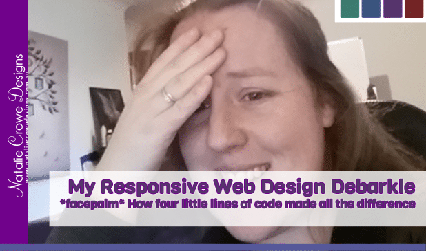
My Responsive Website Design Debarkle | Hunter Valley
Is your website Device Friendly / mobile friendly…. and using responsive design principles??
How I dropped from #1 to #8 on the Search with this Mobile Friendly / Device friendly update…. *facepalm*
Why Hello There?! How’s your Sunday going so far? I’ve been busily working on device responsive designs for my clients. With the changes to the Search Engine Optimisation including making sure your website displayed nicely on all devices, we’re focusing on making your website “future proof” … What this essentially means is not designing a given website to suit specific pixel widths of devices, for example iphone6 ,ipad, android, wide screen monitors etc…
We aim to make our designs flexible and dynamic – with the goal that we’d want our websites to display on all devices regardless of the technology and irrespective of how devices will continue to change in the future.
With the most recent device friendly updates, we’ve been kept busy looking after our own clients and busily restoring their sites to more modern technology… Some of which are more than 8 years old, with the majority of our original clients from back in 2008 still with us today! We definitely wanted to ensure we looked after our clients…
As a result of the influx of work, we personally saw our ranking take a massive hit. We’re talking not just one spot or two… On Friday, my website was ranked #8 for the longtail keyword “Website Design Hunter Valley”… Which we had previously been #1 for many years. Oh Dear!!
I knew I’d been gradually optimising areas of my site, and I’d reworked my designs not 6 months ago… so surely there has to be a mistake?? dropping 7 places on the search – all of a sudden…
I did all the tests to work out what’s going on…. and discover that the problem lies only in my homepage… all of my other pages have the Green Light that they are optimised for devices… 😐
So this weekend, I figured it was about time I blocked out time to do a little in-house maintenance and got myself sorted out..
After much deliberation…. *facepalm*….. there was an error in my homepage code….. Literally there were two “divs” that were in the wrong place…. – 4 extra lines of code – something as simple as :
<div class=”container”>
<div class=”row”>
</div>
</div>
that meant the primary page of my website was deemed not mobile friendly…. and therefore knocked down the rankings….
WOW!! Honestly something so simple… 😐
I’ve now rectified the issue and resubmitted the website again and so far so good, we’re climbing the ladder again… and back at #3 …. we’ll see how the results vary again in 48 hours…
I make note here too.. It took me a good few months in between developing clients sites to actually develop my own site – much like the plumbers tap which leaks at home – you always do your client work before your own….. For clients however it usually takes a week or two to convert their sites.
I just wanted to emphasize here how important it is to keep a handle on the trends, keep your website up to date, and not to under play how long it can actually take to make your site responsive… Whilst in this case it was just a matter of “spot” the problem…. and replacing for lines of codes to make your responsive website design problem go away… It truly helps to have someone who knows what they are looking for to point you in the right direction….
If you’re not sure if you’re website is device responsive, you’re having trouble being found on the search engines or you need some assistance with your website, please feel free to contact us Natalie Crowe Designs – either by leaving a comment below, messaging our page or visiting our website https://www.nataliecrowedesigns.com.au
In the meanwhile… I’m off to make a cuppa, and laugh at myself so being such a goose! Enjoy your Sunday!!!
x Nat